Dr Phillips Center
by Made Media
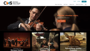
Presenting Our Latest Work: Dr. Phillips Center for the Performing Arts
We were very proud last month to launch the new website and Tessitura-integrated ticketing path for Orlando’s Dr. Phillips Center for the Performing Arts, one of our newest clients. This release was the product of a six-month partnership and represents the first step in Made’s redesign of the Center’s digital presence.
The Need
Dr. Phillips Center first approached us with an urgent and specific need: to provide them with a ticketing path that would give their customers an excellent experience at all times—even during major onsales, where demand for popular events is very high. Several very large onsales were planned for later in 2017, and it was clear that slow loading times and error pages during these key selling periods were out of the question.
The Center’s previous website had been built by a local design shop, and featured a completely custom Tessitura integration. This is no small feat—as Tessitura is such a powerful tool, we know firsthand the learning curve required by developers new to its APIs—but the way the former site was built, with minimal caching and constant polling of the Tessitura APIs even on pages outside of the purchase path, meant that the site struggled to handle even moderate traffic and could easily overstress the Tessitura servers.
The Center needed web developers with hard-won experience building extremely performant Tessitura-integrated websites, and that’s where Made came in.
“Arts For Every Life”
Made started the project, as we usually do, by spending a week on site in Orlando with key members of the Dr. Phillips Center staff. It immediately struck us that this was not your typical arts presenter.
As one of the country’s newest performing arts centers—they first raised their curtain only in 2014—the Center’s founders and leadership wanted to learn from the mistakes of older arts centers, and were intent to avoid projecting any sense of inaccessibility or elitism. We could see this in their internal culture (even back-office staff wear on-brand name badges), in their broad and populist programming, and even in the architecture of the building, which was designed such that the front doors are flush with the street: a visitor doesn’t have to take a step up to come inside.
It was clear to us that the staff really lived their “Arts For Every Life” slogan, and that this attitude was as much a part of the brand as their modernist typography and Florida sunrise–inspired color palette. Our brief, then, was more than just building a website that could handle a major onsale—it also needed to be as welcoming and thoughtful as the Center itself.
The Design
Our mantra when making aesthetic design choices and developing the user experience was always “Simplicity & Beauty.” We wanted a to create a digital experience that was an extension of the friendly, open, and accessible atmosphere a patron would enjoy when visiting the Center. We wanted the experience to reflect the beauty and attention to detail evident throughout the physical space.
To create an arts center that extends well beyond our walls and flows throughout our entire community.
The first morning of our onsite Discovery week, we were taken for a full tour of the Center by the core team. Being shown around the space, meeting staff and hearing anecdotes, we saw how the the Center’s entire philosophy had suffused the architecture and design of the building. This really helped us to quickly develop a deeper understanding of the Center, and informed and inspired much of our initial design approach.
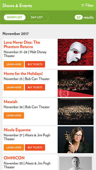
For example, wayfinding signage had been impressively integrated into the building: it never dominates the space, and yet every time you might start to wonder which way you need to walk next, your eyes land on the very directional signage you need. This thoughtfulness fed directly into our approach to the new site’s core navigation. A simple and clean fixed sidebar offers the user immediate entry to ticket purchase, and for further exploration, a single click on the menu icon reveals the entire top two levels of navigation.
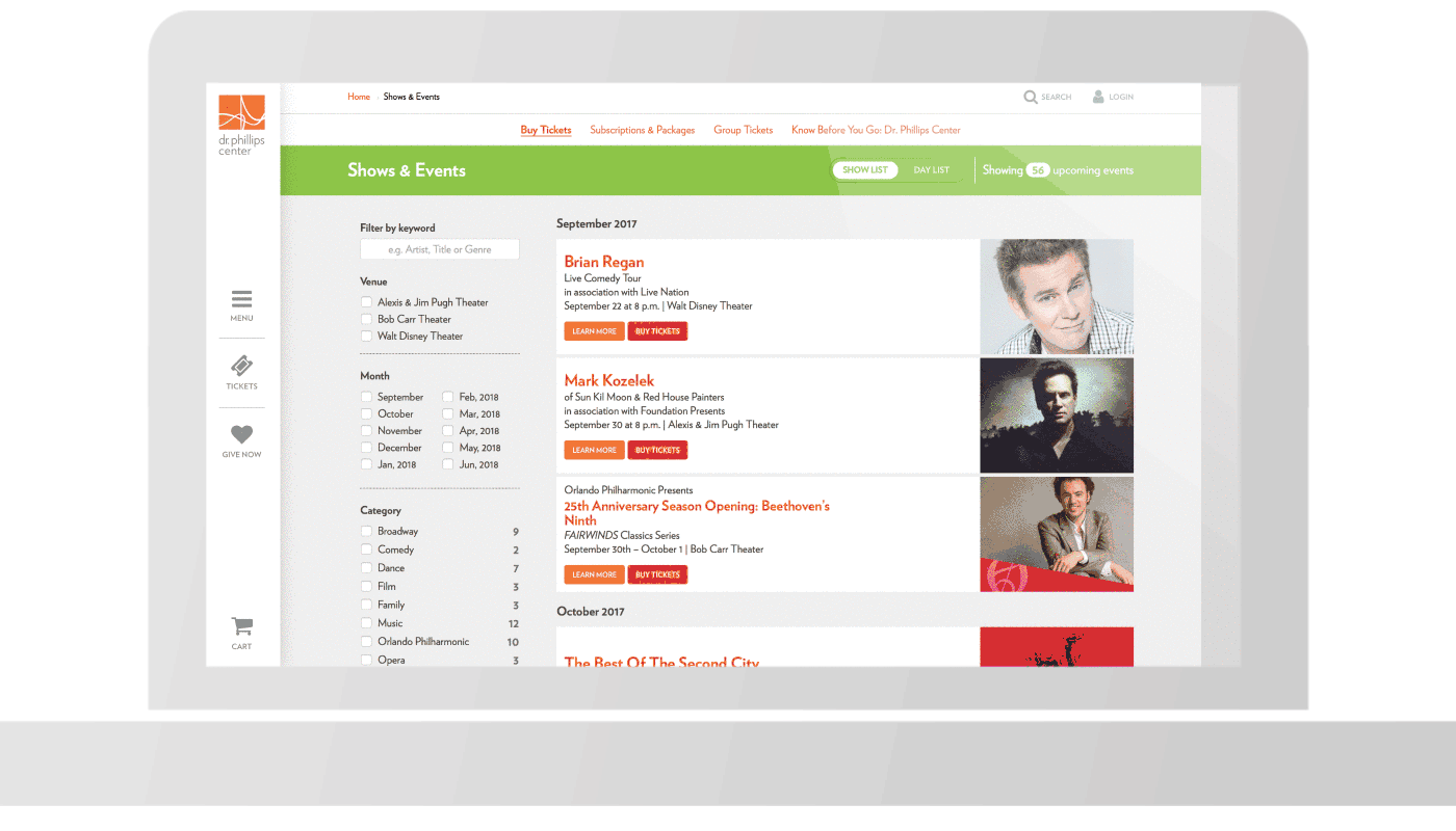
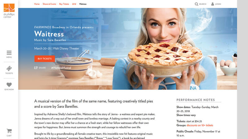
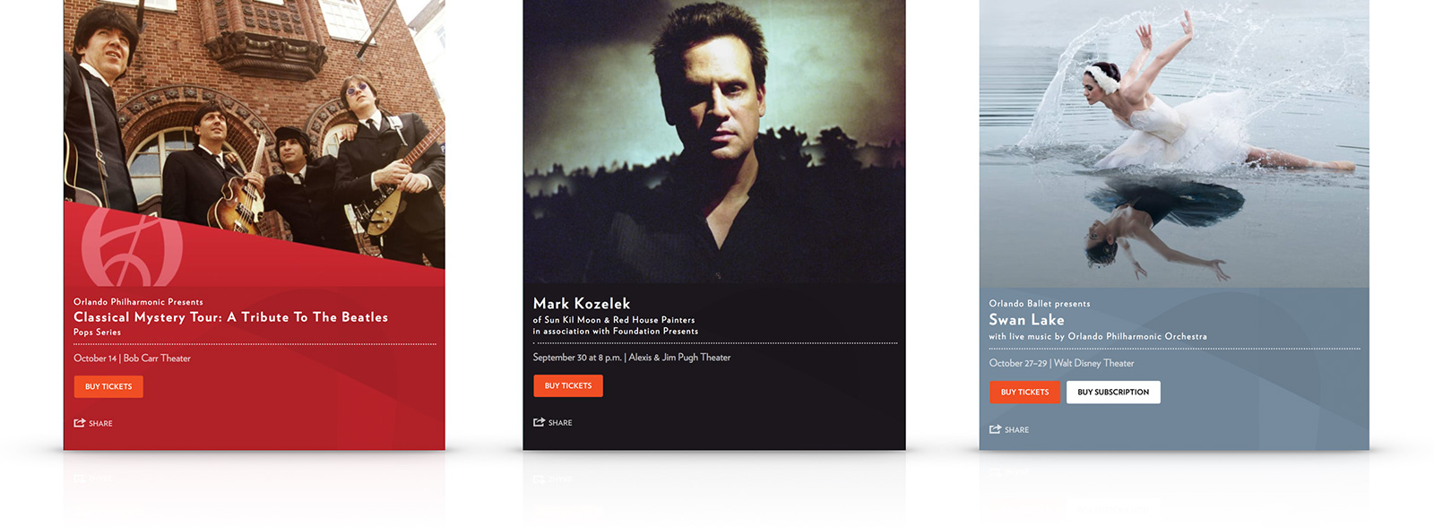
As a presenter, the Center often doesn’t have control over imagery provided for given events. For some shows, they might only have a single image, while other shows might provide them with an extensive range of high-quality assets. We worked closely with the in-house design team to be sure that both extremes could be gracefully accommodated, starting by selecting a base aspect ratio that worked well across mobile devices, thumbnail images, and with the Center’s onsite video screens.
Taking further inspiration from the building’s ability to use lighting to alter the tone of and ambience of the space (for example, by lighting the entire space with green during a run of Wicked), we gave CMS users the ability to apply their own theme colors to individual pages, helping to seamlessly integrate imagery into key production pages.
The Center’s previous design was “responsive,” but suffered from oversized imagery and typography on desktop devices, often overpowering and pushing important content below the fold—a common affliction of mistaking “mobile first” to mean “mobile-only.” With this in mind, we created the facility for an optional full-bleed hero image to be added when appropriate assets were available. This image can be extremely impactful while stopping short of dominating the viewport, and is only served to larger screen devices.
The importance of color for the institution can’t be overstated. Their brand colors were inspired by the Orlando sunrise and Florida citrus tones. (Perhaps that’s no accident—Dr. Philip Phillips was a citrus magnate.) It was agreed that use of large blocks of these vibrant color should be eschewed, in favor of simple whites and subtle grays. Using the vivid color palette sparingly affords it greater visual weight when drawing the user’s eye to key interaction points and calls to action.
And of course, for an institution that prides itself on being accessible to all, Made (as always) ensured the site was delivered to adhere to the WCAG 2.0 accessibility guidelines.
Technology
The new site is built with Made’s preferred CMS for arts organizations, the open-source SilverStripe; CrowdHandler, a Made application that provides capacity control and bot protection; and the ticketing path is powered by a customized implementation of BlocksOffice, Made’s software-as-a-service Tessitura-integrated commerce platform. We find this to be a winning combination.
Like most of our projects (and like the website it replaced), the new site is hosted with Amazon Web Services. Given our long track record with that platform, we know that AWS is not a magic bullet. A combination of careful caching technology, including Amazon’s CloudFront CDN, and carefully structured code keeps the servers happy and the pages loading quickly for the end user.
Results
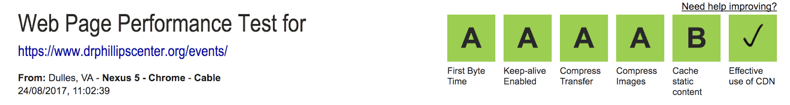
There are more load testing and larger onsales yet to come, but early indications show that the new website is far more performant than the one it replaced.
The site had its first real-world test only a few days after launch, during an onsale for the band Chicago. At peak, with a high level of users were in the ticketing path, page load times stayed below half a second, and the CPU load across the system stayed very comfortably below 10%. This is a far cry from before the new website; excessive API polling on the previous site routinely drove load on their servers as high as 60% even during low-traffic periods.
Joel Schwalbe, Vice President of Technology for Dr. Phillips Center, says: “Made Media was chosen to design, develop, and launch our new website not only because they understand our space, but because they understand our customers. Oftentimes the website creates the first impression for the guest, and it’s essential that this interaction be frictionless and intuitive. The new mobile responsive website absolutely accomplished these things and many more including enhanced navigation as well as improved capacity and performance. We are very pleased with our partnership with Made Media.”
Our thanks go to the Dr. Phillips Center team for a great partnership.